For overseas wholesale buyers, cast aluminum letters are not a decorative afterthought. They are usually part of a larger sourcing decision that involves project specifications, finish durability, installation conditions, consistency across bulk orders, and the risk of complaints after delivery.
That is why this topic matters on a supplier website. Buyers are not only asking what cast aluminum letters are. They are checking whether the product suits a monument sign, a building facade, a hotel entrance, or a branded identification program that must stay consistent across multiple locations.
At YISHANG, we see this pattern clearly. Search behavior often starts with a broad term such as cast aluminum letters, then quickly moves to more decision-driven queries such as thickness of casted aluminum letters, ways to mount casted aluminum letters, cast aluminum letters vs laser cut letters, or how to check the quality of cast aluminum before placing an order.
This guide is written for that buying journey. It stays focused on where cast aluminum letters fit best, what most affects the final result, how buyers compare options, and how to reduce sourcing risk before production begins.
In the sections below, the focus stays on the points buyers usually need most: project fit, typical depth and finish logic, mounting considerations, comparison points versus other letter types, and the quality checks that matter before a bulk order moves into production.
Where Cast Aluminum Letters Fit Best in Professional Signage Projects
Why this product category remains relevant
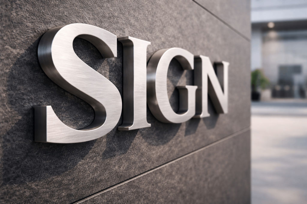
Cast aluminum letters are dimensional metal letters formed by pouring molten aluminum into molds. The process gives the letters real sidewalls and profile depth, which is why they usually look more substantial than flat cut letters made from sheet metal.
That difference matters most in permanent signage. For monument signs, commercial building identification, campus signage, office parks, hotels, and civic projects, the sign is expected to feel integrated into the architecture rather than simply attached to it. In these settings, depth is not just a visual detail. It helps the sign hold its presence over time.
Aluminum is also a practical material for this type of work. It offers a good balance of corrosion resistance, manageable weight, and manufacturing flexibility, which is one reason it remains widely used in architectural applications discussed by the Aluminum Association. For wholesale buyers, that balance affects more than appearance. It also affects freight efficiency, installation handling, and long-term maintenance expectations.
When cast aluminum is a strong fit
A quick buyer reference can help frame the discussion before moving into detailed specification review.
| Buyer Reference Point | Typical Guidance |
|---|---|
| Common use | Monument signs, building identification, hospitality, campus and civic signage |
| Usual visual advantage | Stronger depth, shadow, and architectural presence than flat-cut letters |
| Typical depth range | Often about 3/8 inch to 1 1/2 inches, depending on size and application |
| Common finish paths | Painted, powder-coated, brushed, or hand-finished depending on environment and design intent |
| Best procurement fit | Projects that need repeatable quality, durable outdoor performance, and a premium dimensional look |
For most applications involving long-term exterior identification, cast aluminum letters are selected because they combine durability with a premium dimensional look. They are especially suitable where the sign needs to survive weather exposure while still looking appropriate several years later.
This is why aluminum letters are often specified for monument programs, real estate developments, educational institutions, hospitality signage, and corporate building identity systems. In each case, the buyer is not only purchasing letters. They are specifying a visible exterior component that must support the quality perception of the property or brand.
The best fit is usually a project where three things matter at the same time: architectural appearance, reliable outdoor performance, and practical installation. When those conditions come together, casted aluminum letters often become one of the safest material choices.
When another option may be better
A useful supplier article should also be clear about the limits of the product. Cast aluminum letters are not always the right answer. If the design requires an ultra-thin profile, a heavily illuminated sign face, or a very short service life, another construction method may be more suitable.
This distinction is important for both trust and conversion. Buyers are more likely to engage with a supplier whose content helps them make a better decision, even if that decision is sometimes to use another product category. It makes the content feel more credible and less like a sales page in disguise.
That is also why this article does not drift into unrelated metal products. The focus stays on cast aluminum letters as a solution for professional signage, with comparison points included only where they directly help the buyer evaluate fit.
What Most Affects the Final Look and Performance of Cast Aluminum Letters
Depth and profile: the first factor buyers should review
Once cast aluminum becomes a possible fit, the next question is not simply price. The final result depends heavily on specification choices, and depth is usually the first one to review. The thickness of casted aluminum letters affects shadow, readability, and overall visual weight.
In many commercial signage projects, common profiles range from about 3/8 inch to 1 1/2 inches, although custom requirements are common. The right thickness will depend on letter height, viewing distance, and the mounting surface. A shallow profile may still be technically acceptable, but on a large facade it can look weaker than expected.
This is one reason experienced buyers do not review thickness in isolation. They look at profile depth together with letter size and site conditions. The question is not only how thick the aluminum letter is, but whether the profile will still read clearly once the sign is mounted at scale.
Font and readability: custom does not always mean better
A second factor is font suitability. Buyers often assume that if a logo or typeface looks strong on screen, it will also perform well in cast metal. In practice, some fonts translate cleanly into dimensional letters, while others become too thin, too decorative, or too busy once they are produced physically.
For custom cast aluminum letters, readability matters as much as brand accuracy. A serif face may work well in institutional or heritage-style signage. A clean sans serif may suit contemporary office, retail, or mixed-use projects better. The correct choice depends on the building style, expected viewing distance, and how much detail the casting process can represent cleanly.
This point is especially relevant to distributors and project buyers managing repeat programs. If the selected font is difficult to reproduce consistently, quality control becomes harder, replacements become more likely, and site-to-site consistency can suffer.
Finish and weathering: appearance must survive the environment
Finish selection is another area where buyers need more than generic guidance. Painted cast aluminum letters are commonly chosen when color consistency matters for brand systems. Powder-coated finishes are often preferred when stronger outdoor durability is required. Brushed finishes can work well in hospitality, office, and feature signage where a more architectural look is preferred.
The best finish is rarely the one that only looks attractive in a product image. It is the one that remains stable under the actual conditions of use. UV exposure, heavy rain, coastal air, dust, urban pollution, and cleaning methods all affect how a finish performs over time.
A short comparison helps clarify the decision:
| Finish Option | Typical Use | Main Buyer Concern |
|---|---|---|
| Painted finish | Brand-driven signage programs | Color consistency across projects |
| Powder-coated finish | Exterior walls, monument signs | Better surface durability outdoors |
| Brushed finish | Office, hotel, architectural signage | Premium appearance without excessive gloss |
| Hand-finished cast aluminum | Decorative or high-impact feature signs | Whether the visual effect justifies added complexity |
Mounting logic: design and installation meet here
There are many ways to mount casted aluminum letters, but not every method creates the same result. Stud mounting is widely used because it provides secure attachment and a professional floating effect. Stand-off mounting can increase shadow and projection. Flush mounting may suit very controlled interior environments.
For wholesale buyers, mounting is not just a technical footnote. It affects site labor, alignment tolerance, wall compatibility, and the final visual impression. This is why searches such as ways to mount casted aluminum letters or use to mount casted aluminum letters are common. Buyers are trying to avoid site problems before they happen.
The key point is that depth, font, finish, and mounting should not be decided separately. These variables work together. Good-looking samples can still lead to disappointing field results if one of these decisions is out of balance with the rest.
How Buyers Compare Options and Check Quality Before Placing an Order
Comparison should be tied to project needs, not product labels
In wholesale procurement, comparison is rarely about curiosity. It is about reducing the chance of choosing the wrong specification. That is why buyers often compare cast aluminum letters with laser cut aluminum letters, fabricated letters, or even cast bronze letters.
Cast bronze letters vs aluminum cast letter options is a good example. Bronze can deliver a distinctive premium effect, but it also increases weight and cost. Fabricated letters may be better when hollow construction or illumination is central to the design. Aluminum letters with illumination can also work, but they usually bring more electrical coordination and maintenance considerations.
For many projects, cast aluminum remains attractive because it offers dimensional presence without introducing too much complexity. That balance matters in wholesale supply, where the practical value of a product is shaped by shipping, repeatability, installation ease, and claim risk as much as by appearance. For standard building identification and monument programs, buyers often prioritize repeatable depth, dependable finish performance, and easier quoting over one-off visual complexity.
What quality signals deserve the most attention
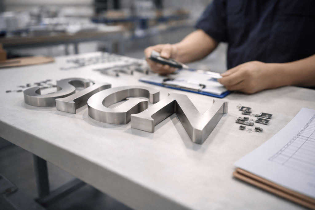
For buyers handling wholesale or repeat-order programs, quality review is most useful when it works like an inspection checklist rather than a brand promise. The goal is not to find a perfect sample under ideal lighting. It is to identify whether the product shows the kind of consistency that can be repeated across the whole order.
The quality of cast aluminum letters can usually be judged through visible consistency. Clean edges, even sidewalls, stable coating, balanced stroke widths, and accurate hardware preparation are stronger indicators than broad marketing claims. Under direct light, buyers should be able to check whether edge cleanup is even, whether coating coverage remains consistent across faces and returns, and whether the mounting setup looks aligned with the drawing or template logic promised for installation.
If a sample shows rough transitions, pits, uneven finish coverage, or inconsistent depth, the issue is not only cosmetic. It may point to weak casting control, poor surface preparation, or unstable finishing. These are exactly the kinds of problems that become more expensive once bulk production is complete.
This is why professional buyers often ask how to check the quality of cast aluminum before confirming production. In practice, they are looking for repeatability. Profile depth should be uniform unless stated otherwise. Coating coverage should be uniform unless stated otherwise. Hardware preparation should also be uniform unless stated otherwise in the specification. In larger programs, even small deviations in return depth, stud placement, or finish tone can slow installation or create visible inconsistency once the letters are mounted as a full set.
Why pre-production checks still matter in experienced teams
Experienced buyers do not rely on quotations alone. They often review finish swatches, mounted samples, dimensional drawings, or pre-production photos before approving volume orders. These steps are not unnecessary caution. They reduce ambiguity between what was quoted and what will actually arrive.
This is also where supplier communication matters. A helpful supplier does not overwhelm the buyer with information that has no bearing on the project. The useful approach is to confirm the details that affect site execution and long-term satisfaction: profile depth, finish choice, mounting hardware, packaging logic, and consistency across the full set.
That approach improves conversion because it supports how B2B decisions are really made. Buyers want fewer surprises, fewer installation issues, and fewer reasons for the final customer to question the result.
Why This Topic Works Well on a Brand Website Blog
A blog article on cast aluminum letters works best when it helps the reader make a better sourcing decision. That means staying close to the search intent behind phrases such as cast aluminum letters, casting aluminum letters, thickness of casted aluminum letters, and check the quality of cast aluminum. These searches are all connected to one core need: the buyer wants confidence before moving forward.
That is also why the article should stay specific. It should not turn into a general article about all metal products, and it should not become a long company introduction. For YISHANG, the stronger approach is to explain the product through buyer concerns: where it fits, what affects the result, how to compare it, and what to verify before production.
This keeps the article aligned with both SEO and conversion. It gives Google a clearer topical focus, and it gives readers a page that is easier to scan, easier to trust, and easier to act on. A focused article like this works best when it gives buyers practical decision support instead of broad promotional language. That makes the content easier to trust, easier to scan, and more useful during real sourcing discussions.)
In that sense, a focused B2B article often performs better than a broader one. It may target fewer readers, but it reaches the right readers with the right level of detail. That is usually what creates stronger inquiries, better-qualified traffic, and a more useful brand impression.
If you are evaluating cast aluminum letters for wholesale supply, project quoting, or custom architectural signage, YISHANG can help review specifications, finish options, and mounting requirements based on the actual application. Send your inquiry today and we will help you narrow down the right option for the project.